Friday, April 13, 2012

#23 Thank You Cards

I just realized that I never posted about the Thank You cards that were designed for the Detillier/Westmoreland wedding. 

Like I said in a previous post, I really enjoyed working with these two. They new exactly what they wanted; it took the guess work out of my job. The bride gave me something to go off of, so I just created something similar. I think it came out beautifully. They just wanted their initials and a key.

Thank You Folded Card: 3.5 x 5
I think the cards cam out nice; Simple yet elegant. We went through several different keys but I love the one we came up with in the end.

The colors of the image is brown and a coral color. The coral color was a color similar to the color of her bridesmaids dresses.

Friday, March 30, 2012

#22 Programs

Tomorrow is the wedding of one of my clients: Kimberly Detillier and Jordan Westmoreland. I did their programs and Thank You notes.

Programs
I can't speak for anyone else, but for me, programs are one of the most time consuming things to design and the most expensive when it comes to getting things printed.

I worked really close with this couple over the last month to put everything together. Their programs is six pages including a backing page tied together by a bow. I will be positing more photos later.


With programs you have to choose fonts that are clearly readable because they are a guide for you guests about the ceremony of the wedding.


All the pages before putting the Programs together.


#21 Invitation Suite For Fisher Wedding

 Black, Red, & Silver. This is one of my favorite color combinations. A few months back, I was contacted by another roommate, this one from my Disney College Programs days. After telling me she, Donielle Fisher, was engaged, she asked me if I would design something for her wedding. I couldn't be more excited to have the chance to do something for someone so deserving.


She then told me her color combo; I was excited. I love working with people who know exactly what they want. It kind of makes my job a lot easier.  All she told me was that she and her fiancĂ© wanted a black invitation with silver lettering; they also wanted a red ribbon attachment. She was specific in saying she didn't want a bow.
Invitation Suite


After many emails and Forsook messages, we finally came up with the right fonts and wording making for a very sophisticated and romantic outcome.

I really enjoy working closely with brides and grooms to make something beautiful for their special day. To me, invitations are something that should represent the design and feel of your wedding. It is the first glimpse to your guests into what your wedding will be like.

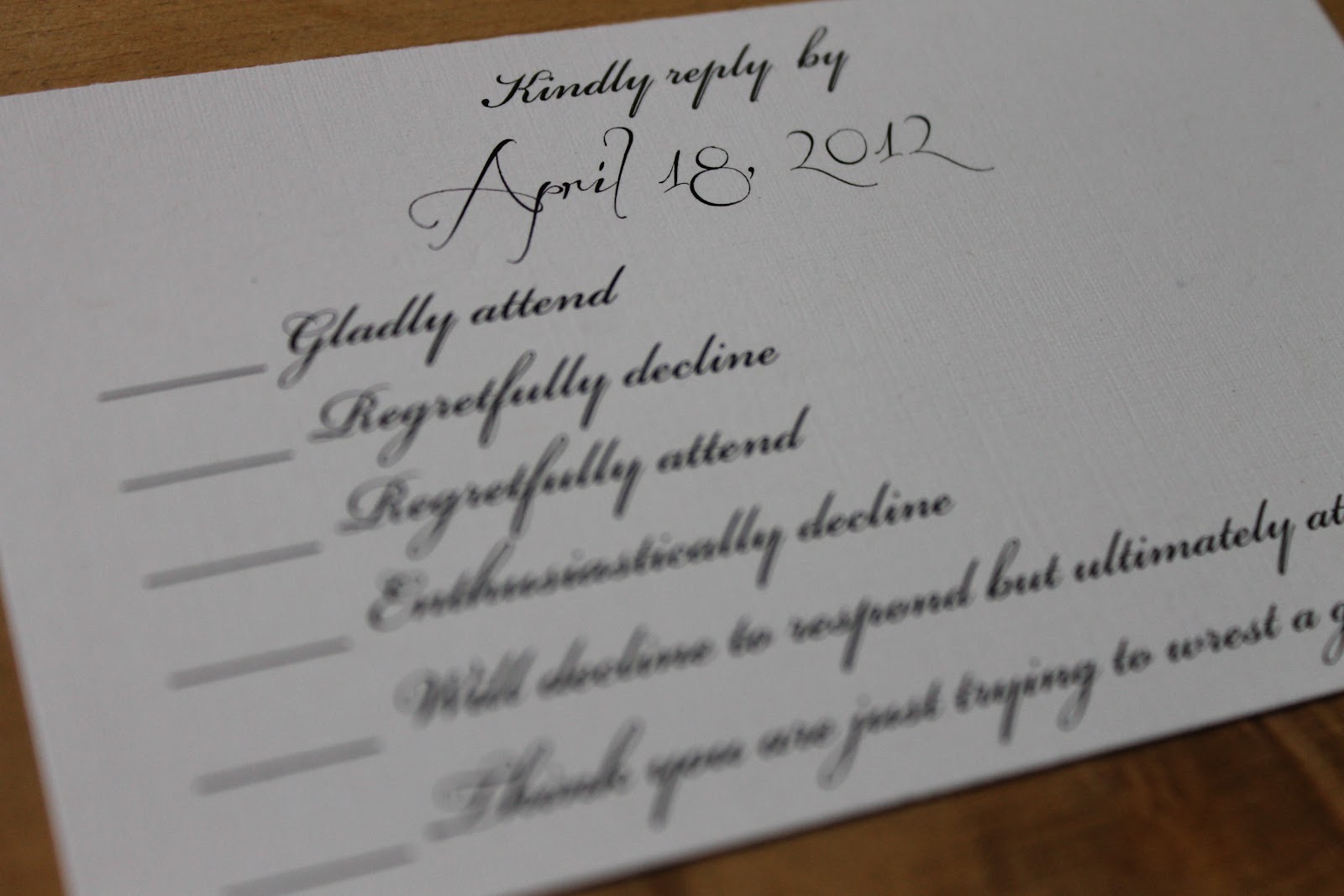
RSVP Cards: Donielle, the bride, sent me an image of something she wanted to do for her RSVP cards. I was laughing hysterically when I read what she wanted.
RSVP Card


Gladly attend
Regretfully decline
Regretfully attend
Enthusiastically decline
Will decline to respond but ultimately attend.
Think you are just trying to wrest a gift out of me.


Detail 

In all honesty, the colors were a welcomed change from the purples and greens.


#20 Invitation Suite for Himber Wedding

Wedding Invitation
I know it has been a while since I posted something. Sorry for the length but the Himber Wedding Invitation Suite has a lot of elements.

Invitation
RSVP Postcard
Direction Card
Accommodation Card

The bride and groom were very easy to work with. Like I have said in a previous post, the bride was a college roommate of mine. When she messaged me on Facebook about designing the paper goods for her wedding, I was both thrilled and excited.

Designing wedding invitations is sort of both scary and exciting at the same time. A Save the Date is the first thing an invited guest sees about the wedding; it sort of sets the tone on what that guest thinks the wedding is about. So when the invitations go out, it sort of adds to what the guest is thinking.
Close-Up Detail

I like to work closely with the couple since it is their day not mine. The bride told me that the wedding was definitely a southern wedding with flares of Louisiana and Texas.

At first, I didn't know how I was going to accomplish that task. The bride was inspired by my cousin's wedding. She was having similar colors, so I went from the there. 

I am a designer who loves typography, so messing around with fonts is right up my ally. I think we went through four or five different invitations before settling on the one we ended up with. After the basic invite was decided on, we still did a little bit of tweaking. When all was said and done, both the couple and I were excited about what came out.
Detail of the Invite: The Image
RSVP Postcard
I wanted to say that the RSVP postcard was my favorite element of the invitation suite. We came up with something I think is beautifully done.

Front
The image is of the wedding venue. Thanks to Adobe Photoshop I was able to make the image look more vintage and romantic. The bride and groom decided not to put any words on the front not to take away from the image.
Back
The back of the postcard had to be beautiful yet functional. It had to incorporate all of the information need for the guests to RSVP to the wedding. Again, we went with a vintage feel to go with the front of the card. 
Detail

Accommodation Card


Direction Card


All in all, I think everything turned out great.

Thursday, March 22, 2012

#19 First Shipment

On March 14, 2012, Mayet Graphics made their first shipment out on an invitation suite for the Himber/Mustian wedding. First and foremost, I have had a pleasure of working closely with the bride and groom. I love it when a groom is just as much a part of the process of planning for a wedding. Because when you think about it, it is his day too.

I really enjoy working with brides and their grooms in creating all of their paper goods for the wedding. I really enjoying taking the inspiration and colors from the happy couple and making something unique and special for them.

After everything has been designed and printed, it is time to send them out. The picture below is what the table looked like when before the packed everything.
Packing the Box


What everything looks like when it is packaged inside the box. 
When packaging everything, I want it to look uniform. So I wrap everything
 I tissue paper, one that matches the colors of Mayet Graphics, and put a label on it.
 
"What's in The Box," aka The Packing Slip

When all is done, the box is taped up nice and snug with bubble wrap. A mailing label is put on the box and finally shipped off. 

I couldn't be more than thrilled to have shipped out my first invitation suite. Photos of the Invitation Suite will be posted later on.


#18 Save the Dates

I know it has been a few weeks since I posted something here, but my little fingers have designing a lot lately. I also have been running around like a chicken with my head cut off going back and forth to my printer.
Save the Dates for the Himber/Musitan Wedding.
A few weeks back the Save the Dates for the Himber/Mustian wedding went out. (It took me a while to post this, because I waited till they went out to her guests.) 


Courtney, the bride, was inspired by my the paper goods I did for my cousins wedding. 


Her colors were a deep purple and green. It is kind of hard for me to describe the green color. I want to say lime green, but it is not a lime green. It has a little more green the the tone and less yellow. Anyway, green and purple work really well together. 


We we were emailing back and forth, she told me her theme was a Southern Wedding. Being a southern girl myself, I absolutely loved it. "Southern Weddings" are always romantic and beautiful with a hint of sophistication. Also, she told me it sort of a Texas meets Louisiana wedding since the bride was from Texas and her groom, Mike, was from Louisiana. 


I have had a blast working with Courtney and Mike. Photos of her invitation suite will come later. 

Tuesday, January 31, 2012

#17 Clone Tool in Photoshop

I know I probably should have posted about this sooner. My grandmother asked me if I could take some people out of a photo. She wanted the couple in the front to be by themselves. I was extremely happy and excited to do this for her.
He made me practice my photoshop skills. I love to be able to help out anyone in my family with the skills that I have. My grandmother was gracious enough to allow me to do this for her. I know she could have go somewhere else.

For this particular project, the clone tool was used for the most part of the project. A lot of hours, on my part, was spent looking very closely at my computer screen. Mind you, this was before I received my 15 inch MacBookPro computer. I did this project on my 12 inch Powerbook G4.

I constantly had to zoom in and out of the image to make sure I wasn't changing anything that needed to be changed. This project made me become very familiar with the tool. I had to play close attention to what was at task.
The photo above and to the left is what I started out with.
The photo to the above is what the finished product looked like. I think it came out pretty good after the many hours spent in front of the computer. My grandmother was really happy with how it turned out.